
THE WORK
Create the entire visual language for IPP’s final line so the brand could go sailing off into the sunset in style.
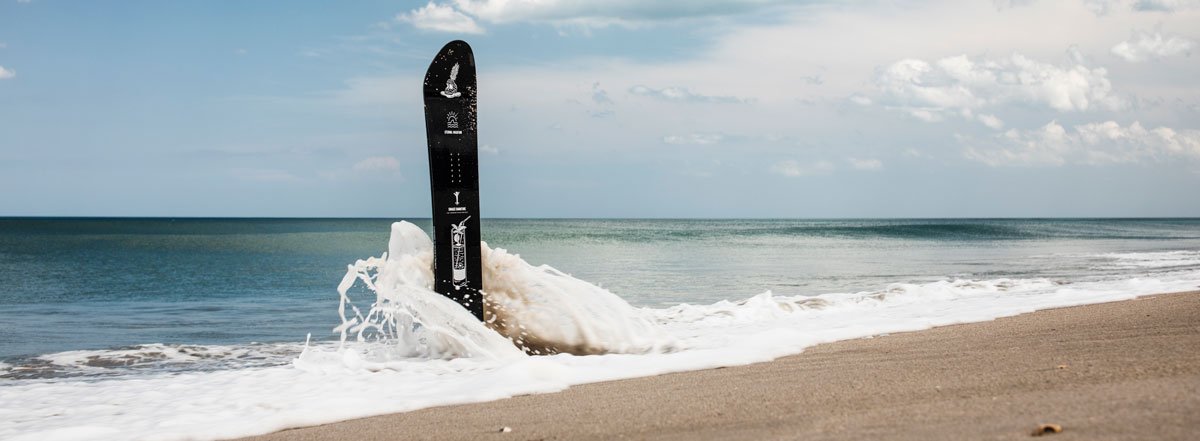
Coming into their 9th and final year as the most dedicated, doing-it-for-the-love brand in snowboarding, IPP wanted to walk the plank with a smile on their face. They needed a line of boards that captured their brand aesthetic while merging the two worlds they were existing in at the time, the dream of the snowboard life with the dream of a never-ending tropical getaway.
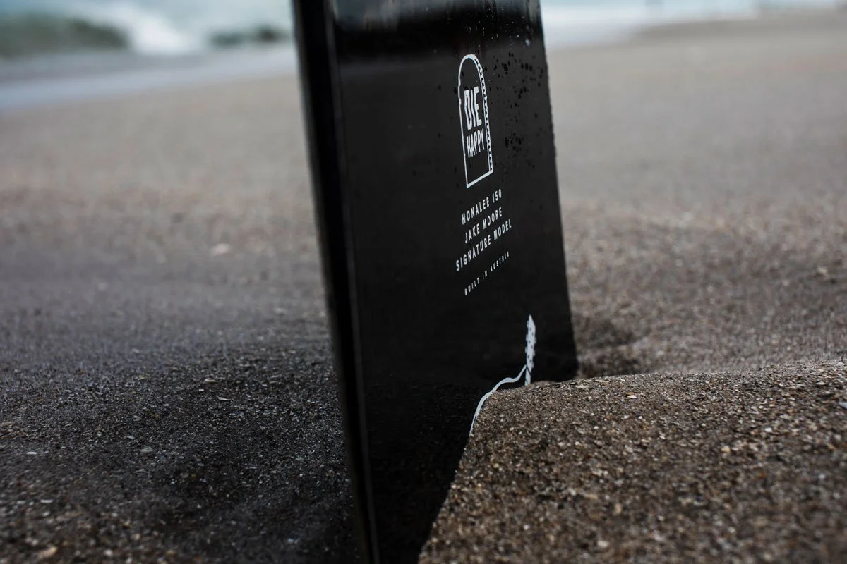
As Art Director, I translated the owner's vision into the line's visuals, making the call on how each board would represent the Eternal Vacation theme while staying true to its own personality. When IPP hesitated on putting "DIE HAPPY" across the base of one board, I pushed for it, betting it would stand out on shop walls. In a line that sold through to retailers in record time, that board ended up being the fastest model to do so.

MY ROLES
Art Direction
Illustration
Graphic Design
COLLABORATORS
IPP’s Founder
OUTCOMES
Fastest sell-through rate
of any previous line

The Theme
ETERNAL VACATION
With an ethos of Die Happy, the overarching theme of Eternal Vacation is a way for those connected to this frigid snowboard lifestyle to come together with those searching for a lifetime of warm, sunny beaches. No matter your preference, we all just want life to feel like one never-ending vacation.
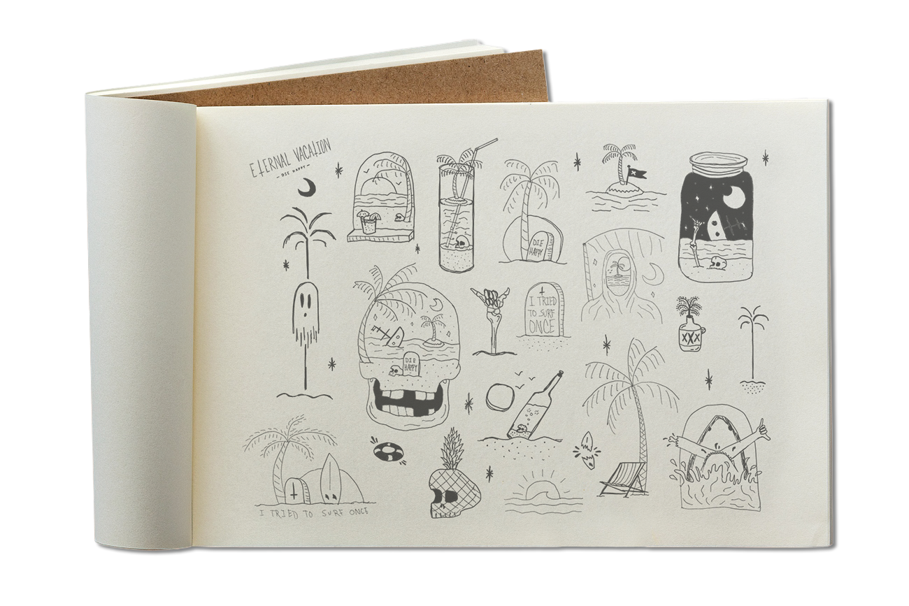
The Sketches
The rough sketches and early ideation set the tone for the type of imagery that will be used across the line.
The Story
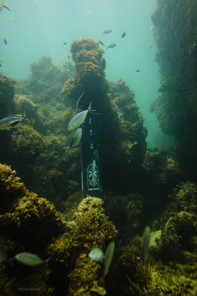
BOARD: The Harrow

While all the boards needed a cohesive look, it was important that the individual graphics reflected the personality and riding style of each board. I worked with the IPP crew to tell a story and visually represent each board's individuality.
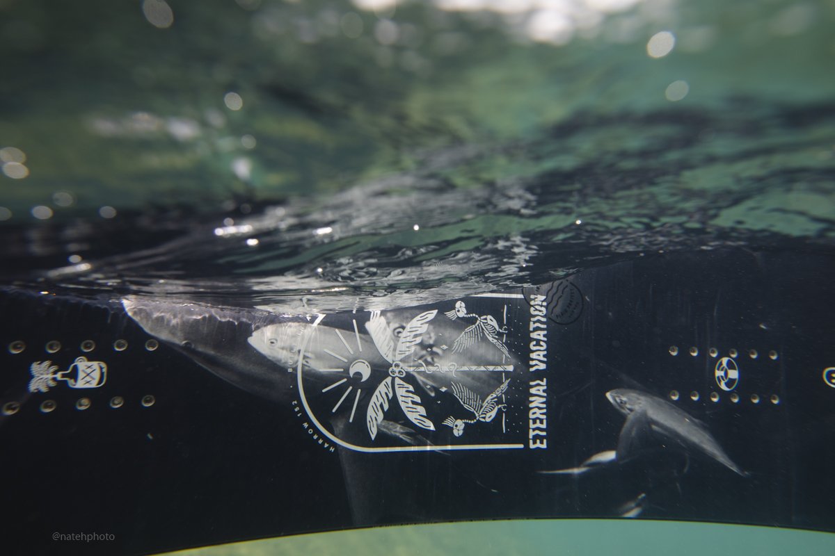
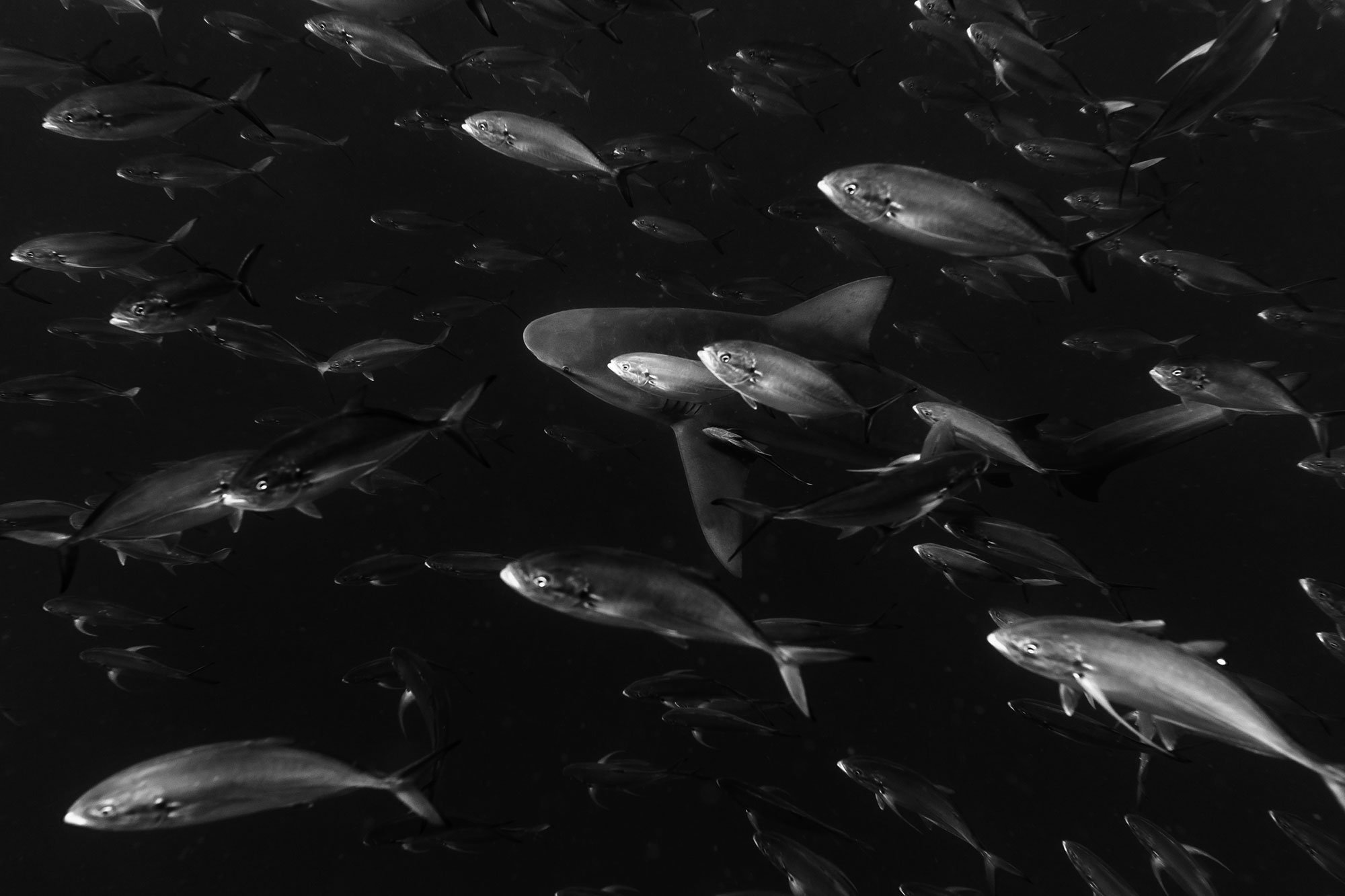
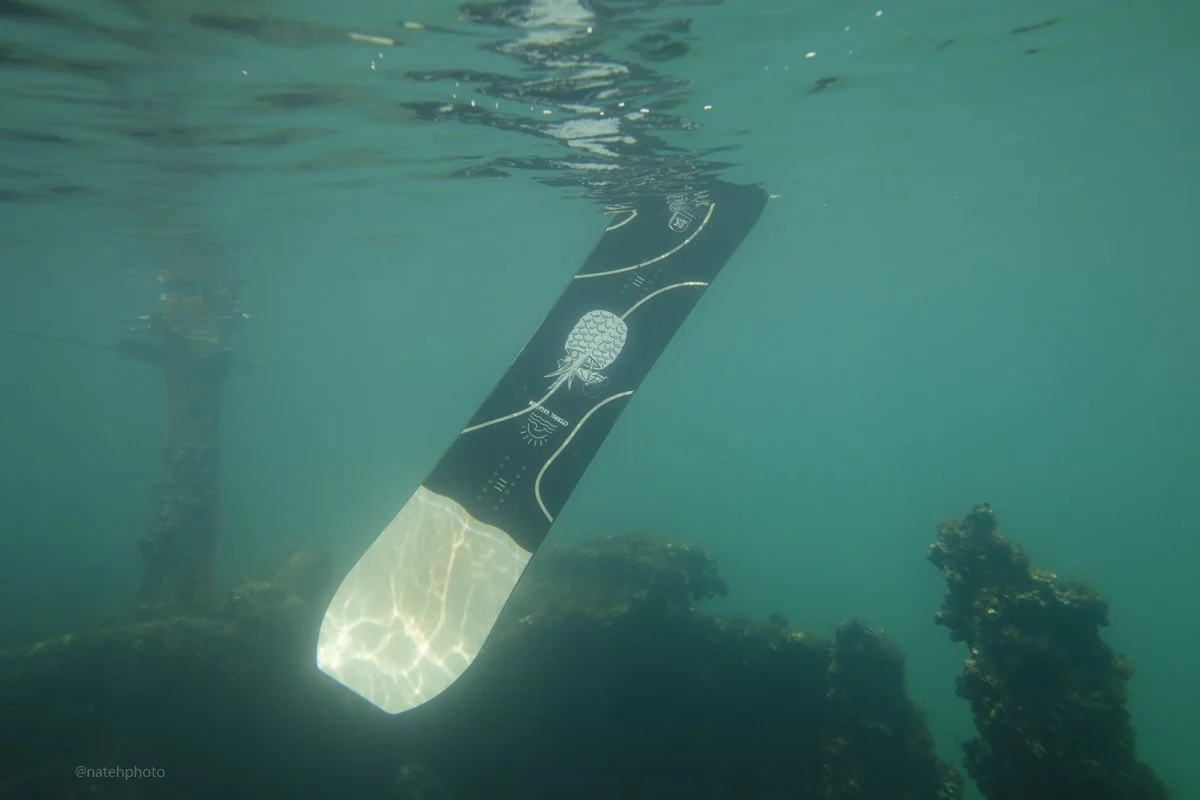
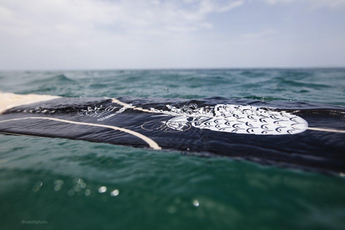
As soon as I saw Nate Harrington’s dark and moody shark shots I knew they’d be perfect for the Harrow’s playful yet powerful persona.
And come on, how badass is a snowboard base that just says “DIE HAPPY” on it!?



The Collaboration
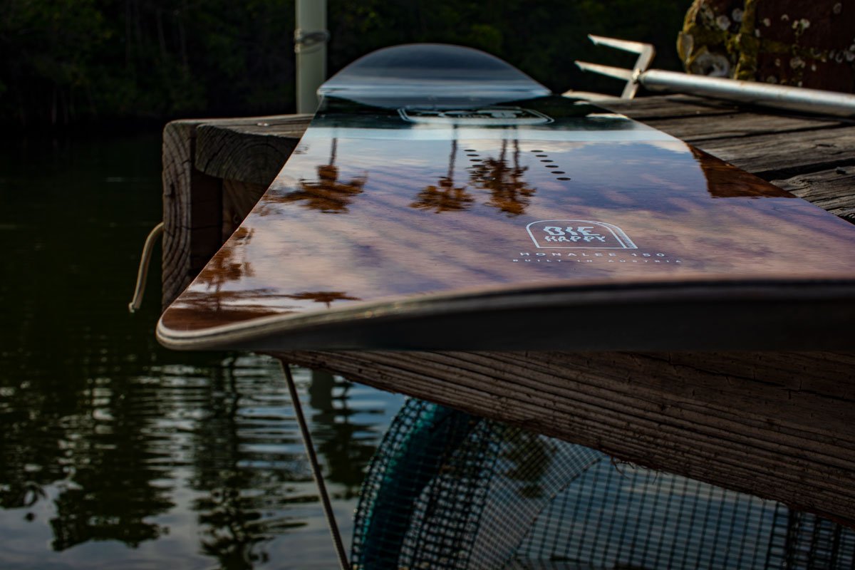
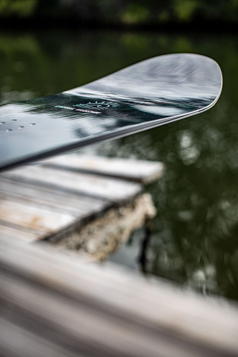
BOARD: The Honalee

The Honalee was the first board to come from this collaboration of creatives.
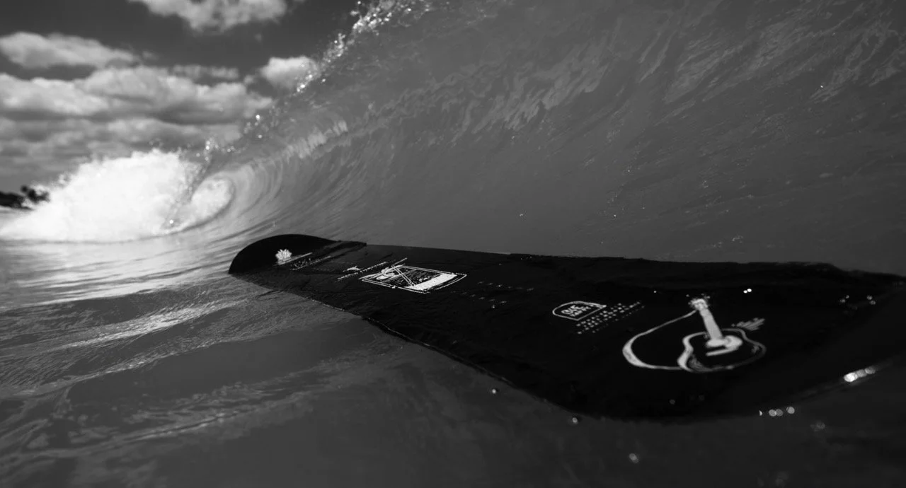
These designs stemmed from some unused skateboard graphics I created and were the catalyst for the whole Eternal Vacation collection.
Personally, I think these boards best capture the aesthetic we were going for and are my favorite combo of Nate Harrington’s incredible tropical shots and my low-brow illustrations.


The Process
BOARD: The Odessa

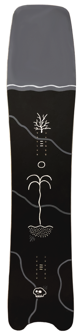
Back at the beginning of 2019, I hand-painted a snowboard for a drawing-a-day project. This experiment ended up serving as the Odessa prototype.
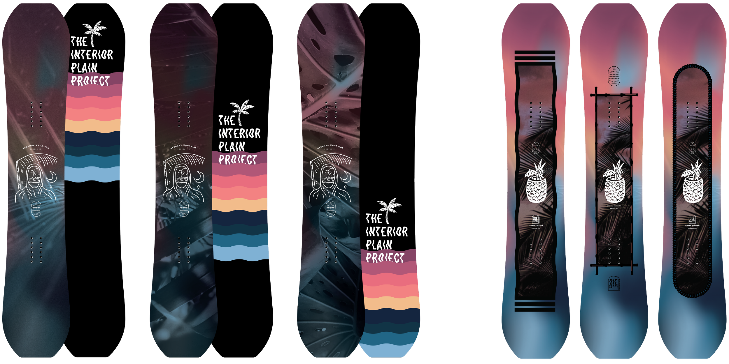
But before we decided on this look we probably went through the most ideation and revisions of any other model to get here.
Steal a glimpse at some of the unused versions and color exploration that led to the boards before you.

The First Drafts



The Inspiration
BOARD: The Signatures

This whole project came about from my past life on the icy hills of Minnesota, a place full of snow birds and a select few who stick around all winter to thrive in it.
The Eternal Vacation line was an effort to bridge that gap between those seemingly opposite worlds.
The signature models were created to represent & acknowledge some of the key riders piloting IPP’s crafts.